APLIKASI PENATAUSAHAAN HASIL PENGURUSAN PIUTANG NEGARA (APIK)

Project Overview
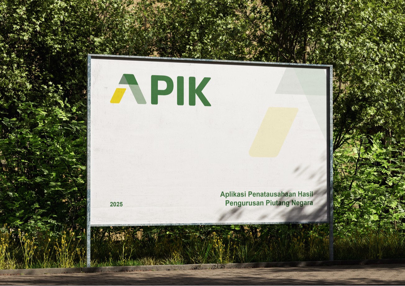
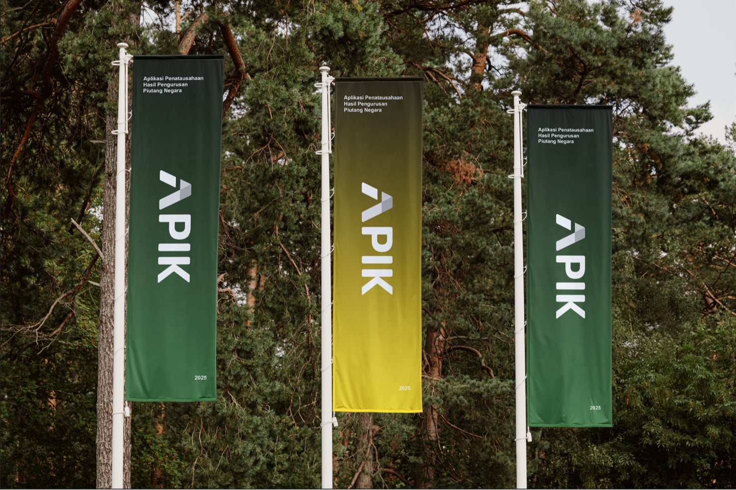
APIK (Aplikasi Penatausahaan Hasil Pengurusan Piutang Negara) is an information system that provides information and consultation services related to state asset management to the public. The logo is designed in green, symbolizing growth, sustainability, and prosperity, and yellow, representing optimism, creativity, and energy, thereby reinforcing the positive and professional image of this application.


Logo Concept
The APIK logo is designed using the silhouette of the letter A as the main initial of the application. Its modern and minimalist form reflects a renewed spirit that is professional and aligned with the needs of a digital public service. The color green symbolizes growth, sustainability, and prosperity, while yellow represents optimism, creativity, and dynamic energy.
Visual Philosophy
The visual identity of APIK is developed to present a modern appearance while still carrying the essential characteristics of DJKN as the governing institution. The design maintains a professional tone yet introduces a fresh, contemporary look to ensure the application feels current and easily recognizable.
Brand Characteristics
APIK embodies the values of being modern, friendly, and professional, representing a public service that is accessible, inclusive, and user-oriented across both digital platforms and real-life interactions.
Target Audience
The target audience includes all Indonesian citizens, regardless of background or age. The visual identity is crafted to remain universal, ensuring clarity and acceptance across various usage contexts, both online and offline.
Deliverables
The project deliverables include key visual identity components such as the primary logo, brand color guide, and basic visual applications for communication needs.